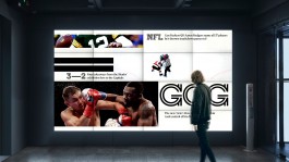
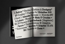
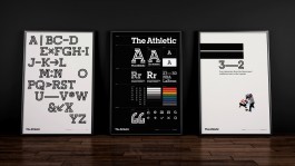
01/14
THE ATHLETIC
(brand identity)
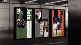
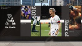
Launched in 2016, an upstart in the journalism field, The Athletic creates in-depth sports stories, written by a high-calibre roster of writers across local, national and international beats. Fans can access a curated feed of stories and over 100 podcasts through the subscription-based app, allowing them to draw a deeper connection to their favorite teams on a daily basis.
The Athletic has over 1m paid subscribers, placing them in the top 5 of subscribed news sites, along with The New York Times and Wall Street Journal. As their audience continues to grow, they needed to develop their brand story, and expand their creative toolkit.
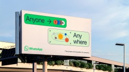
02/14
(brand identity)
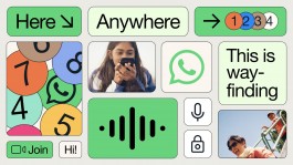
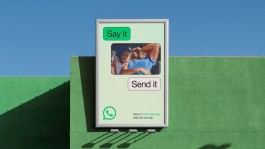
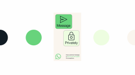
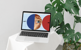
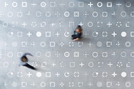
WhatsApp is not a social media tool. It’s a secure, intimate product designed to give anyone—anywhere in the world—the ability to connect and enact change.
We want to evolve the brand, developing a universal design system that further deepens the connection between product experience and marketing. Driven by the notion Forward. Together, we stayed true to the promise made to WhatsApp’s 2 billion+ users in providing an accessible, safe and robust communication tool—building on this foundation, giving space to explore the brand’s emotional landscape.
→COMING SOON
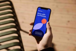
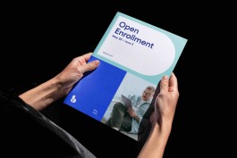
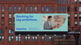
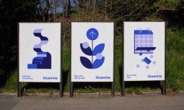
03/14
BLUEVINE
(brand identity)
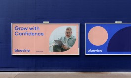
A comprehensive rebrand for our fintech friends, bringing their entrepreneurial spirit and focus on small business to life via an entirely new brand language. Our year-long collaboration involved extensive customer research, qualitative testing, brand strategy, communications frameworks, and every other facet of visuals and voice you can imagine.
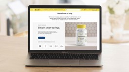
04/14
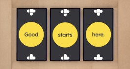
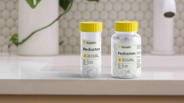
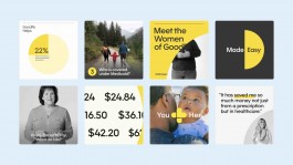
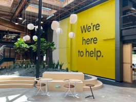
GOODRX
(brand identity)
Good health is a vital foundation for a good life, yet almost half of Americans have inadequate access to healthcare. GoodRx helps people get the care they need at a price that they can afford.
As they expanded their offerings to support the unique vision of changing the healthcare landscape, GoodRx needed to revamp their brand identity in order to connect with a broader audience in a deeper way. We partnered with the GoodRx team to develop a unified brand identity that integrates into their holistic healthcare offerings.
05/14
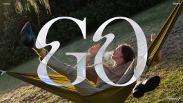
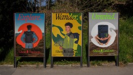
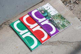
GHOST OUTDOORS LOOK BOOK
(print, editorial)
Ghost Outdoors was founded in Perth, Australia with a simple mission: To make camping and outdoor gear inspired by Australian-style adventuring — cutting loose and breaking free.
The new identity was rolled out across the brand’s website, social platforms, print lookbook, and drop-bear-ready gear, establishing Ghost Outdoor as a trusted companion into the outback — all while having a bit of fun along the way.
→COMING SOON
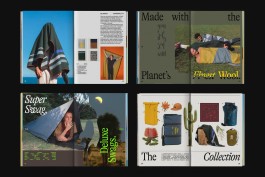
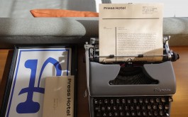
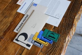
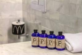
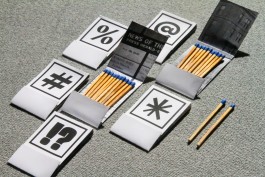
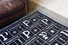
06/14
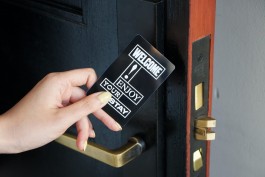
PRESS HOTEL
(identity)
Magnificently reborn, the Press Hotel is located in what was once the Gannett Building, housing the offices and printing plant of the Portland Press Herald, the state’s largest newspaper. The story of rebirth is what this hotel wants to communicate; however, its current identity is not in line with the story. With rebranding of the Press Hotel, guests should be able to experience type and the history of the former newspaper building not only through vintage interior design but also through a modern visual identity system.
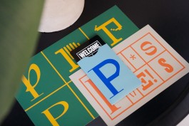

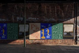
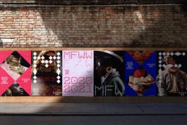
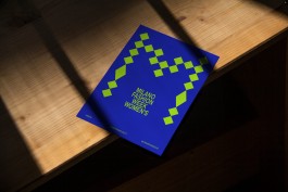
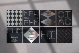
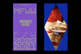
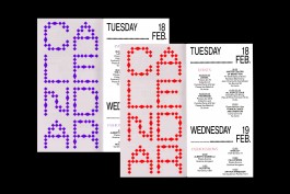
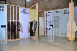
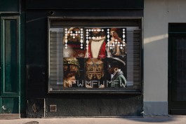
07/14
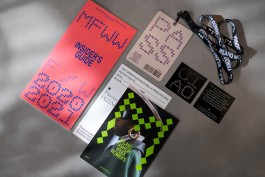
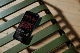
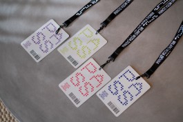
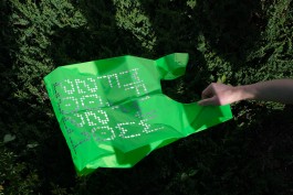
(brand identity/event)
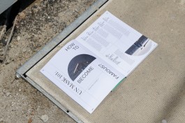
A branding project rooted in deep research of how Fashion Week is perceived and presented worldwide. My methodology and approach will be expanding critical thinking skill sets and extending form making design approaches that would represent a refresh and appropriate graphic identity system for Milan Fashion Week. The project developed an appropriate and strategic graphic identity for fashion week that can be implemented over print, screen and environmental applications along with social media strategy focusing on promoting different aspects of fashion week and organizing various content for the audience.
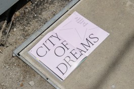
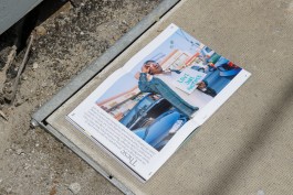
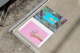
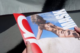
08/14
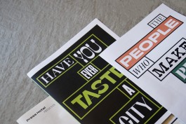
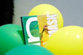
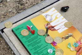
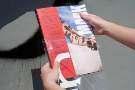
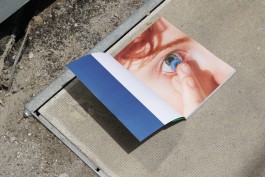
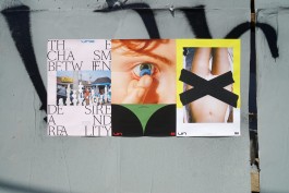
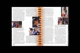
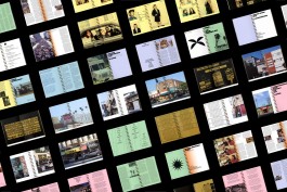
UN MASK MAGAZINE
(print, art direction)
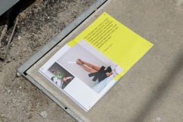
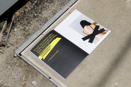
Un Mask is a bi-annual magazine that explores the contradictory relationship between the subject matter and its hidden nature. Each issue captures and reveals something that seems right but is actually unexpected. Readers will be exposed to the unveiling truths and the behind-the-scene secrets in the field of art, social, and political context.
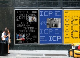
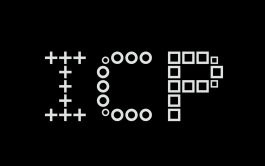
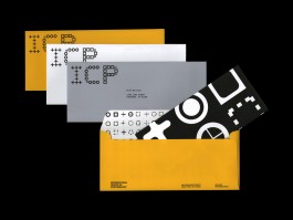
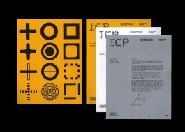
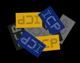
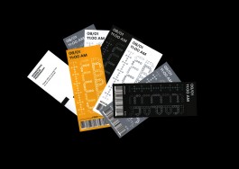
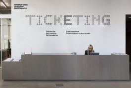
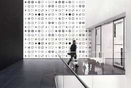
09/14
INTERNATIONAL CENTER OF PHOTOGRAPHY
(brand identity)
The International Center of Photography is the world’s leading institution dedicated to photography and visual culture. Cornell Capa founded ICP in 1974 to champion “concerned photography”—socially and politically minded images that can educate and change the world. Through our exhibitions, education programs, community outreach, and public programs, ICP offers an open forum for dialogue about the power of the image.
10/14
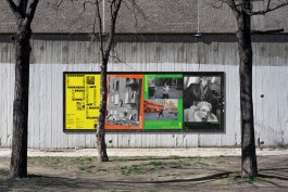
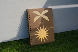
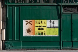
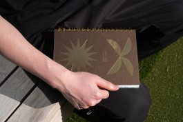
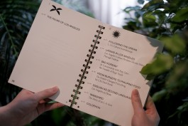
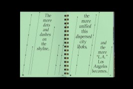
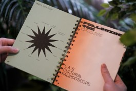
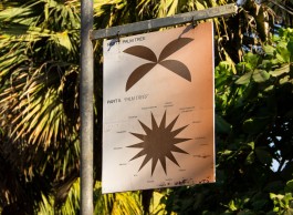
PALM TREE, "PALM TREES"
(print)
Palm Tree, "Palm Trees" is a love letter to Los Angeles. After living in LA for 8 years, this is a place where I call "home". But what makes LA LA? This publication uses a seemingly native plant–palm tree, as a starting point to address the cultural diversity of Los Angeles.
11/14
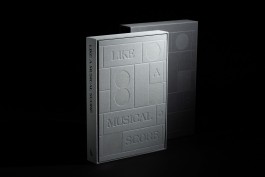
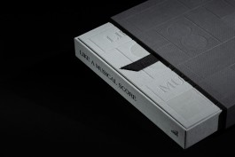
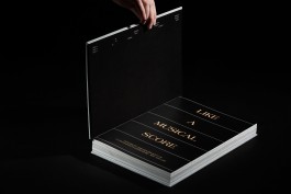
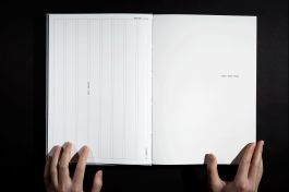
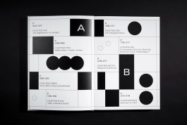
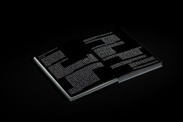
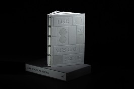
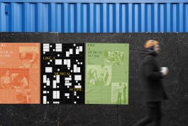
LIKE A MUSICAL SCORE
(print, art direction)
Like a Musical Score is a publication about variability and multiplicity of constraints in literature, art, and life. The subjects include Oulipo group, Sol Lewitt, John Cage, Fluxus, and Yoko Ono. This book opens and ends with a set of instructions. The chapter breaks are an abstract musical score, and the placement of the "scores" determines where the text and image are being placed in each chapter, as a constraint to challenge myself as a designer.
related project:
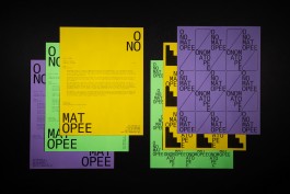
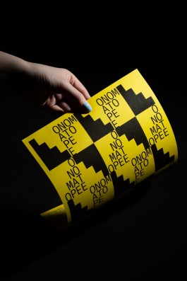
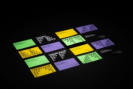
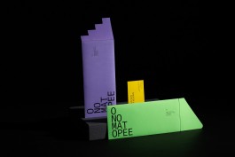
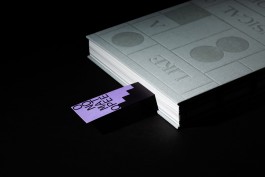
ONOMATOPEE
(brand identity)
Onomatopee Projects, founded in 2006 and directed by Freek Lomme since, is a curating and editorially led public gallery and publisher that is particularly known for their self-initiated and transdisciplinary projects. Furthermore, they also host the projects of progressive individuals as well as artist-run and institutional organizations.
12/14
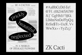
ZK CACTI
(typeface)
ZK Cacti is a transitional serif display typeface that is inspired by the sharpness and the roundness of cactus. The skeleton is based on Times New Roman, with modification to mimic the characteristics of cactus.
→(Coming Soon...)
13/14
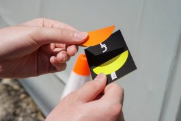
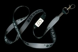
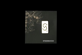
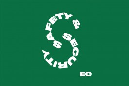
STARBUCKS S&S*
(freelance)
A logo designed for Starbucks Safety & Security Service department. The pins are given out to employees as a reward for the departmental anniversary event.
*Upon Request
14/14
APPLE INC.*
Worked with creative director and art directors to create retail graphics, product imagery, and Apple internal projects.
*Upon Request